Build a Custom Shopify Dashboard with Data That Matters


As a Shopify merchant, you probably start your day by checking your dashboard.
Why? Because every number on that screen influences your next decision.
Should you increase your ad budget? Reorder inventory? Push a different product? Investigate why margins are shrinking even though sales are growing?
Shopify does a great job of reporting store performance, taking you as far as sales, traffic, orders, and gross profit. But many of the numbers that determine actual profitability happen outside Shopify: advertising costs, product costs, fulfillment charges, payment processing fees, and other operating costs. The native dashboard has limited flexibility in how those costs are captured and calculated, which limits both the insights you can uncover and the decisions you can make.
So, is the solution another dashboard or a dashboard built around the data your business actually needs? That's exactly what we'll explore.
TL;DR
Shopify's Metrics Library lets you customize your dashboard layout, but its built-in analytics limit the business questions your dashboard can answer.
As your business grows, the metrics that drive decisions extend beyond revenue and orders to include profitability, marketing performance, customer behavior, and operational costs.
Bloom helps you build a dashboard around those decision-making metrics with customizable dashboards, formula-based custom KPIs, and profit analytics in one place.
Can You Change Your Shopify Dashboard?
Yes, within limits. Shopify's overview dashboard supports a meaningful level of layout customization through its Metrics Library. You can add, remove, rearrange, and resize metric cards to surface the KPIs you check most often without navigating through multiple reports.
Depending on your Shopify plan, available metrics include sales, orders, customer behavior, marketing, inventory, finance, and other store performance reports. These reports help support day-to-day decisions, whether you're checking which products generate the most revenue, how many customers return to buy again, or where shoppers abandon their journey.
However, as businesses begin tracking more than sales, investing more in marketing, managing multiple costs across different tools, and making increasingly complex business decisions, the questions they need answered extend beyond what Shopify's native metrics were designed to measure.
What Are the Limitations of Shopify's Native Dashboard?
While Shopify lets you customize your dashboard's layout, you're still limited to the metrics and calculations Shopify's analytics platform supports.
As reporting needs grow, merchants often need to track net profit, contribution margin, break-even ROAS, blended CAC, customer lifetime value, or custom operational costs such as payment processing fees, shipping costs, and other overheads. These metrics aren't available in Shopify's native dashboard because they rely on additional data and business logic outside Shopify's analytics. This means you can't create new KPIs, build custom formulas, or combine data from other business systems.
Eventually, many businesses outgrow Shopify's native dashboard and adopt analytics solutions that support additional data, custom calculations, and business-specific analysis.
What Does It Actually Mean to Change Your Shopify Dashboard?
For most merchants, real dashboard customization starts with a simple shift: instead of displaying the metrics Shopify provides, you prioritize the metrics your business actually runs on.
That means enriching Shopify's native data with information it doesn't track on its own: advertising spend from Meta, Google, and TikTok; fulfillment costs from your 3PL; payment processing fees from third-party gateways; product costs by purchase order; and other operating expenses. It also means defining how those costs are calculated for your specific business and building the KPIs that reflect how you measure performance.
With those inputs in place, your dashboard can surface metrics like net profit, contribution margin, profit by product, order and channel, and break-even ROAS alongside revenue, answering not just how your store is performing, but whether it's actually profitable.
Some merchants build this using business intelligence tools like Tableau, Power BI, or Looker Studio. Others choose purpose-built ecommerce analytics platforms that provide these capabilities out of the box. Bloom is designed for merchants who want that flexibility without the overhead of maintaining a BI stack.
How Bloom Extends Shopify Dashboard Customization
Bloom lets you build dashboards around the questions your business actually needs answered by combining Shopify sales data with profitability, marketing, customer, and business-specific cost data that Shopify doesn't natively track. Instead of being limited to predefined reports, you choose the metrics, charts, and tables that matter most, creating a dashboard tailored to how your business actually operates.
The examples below show what that looks like for three different business scenarios.
Example 1: Which products made me the most profit?
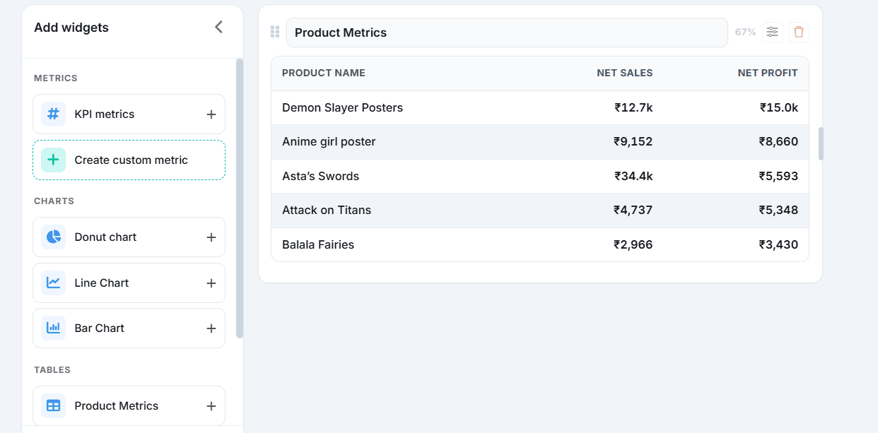
This dashboard compares Net Sales with Net Profit for every product, with Net Profit calculated by Bloom after accounting for COGS and advertising spend.
The results tell a different story from revenue alone. Demon Slayer Posters generated ₹15.0k in net profit from ₹12.7k in net sales, making it the most profitable product in the period. Asta's Swords generated the highest net sales at ₹34.4k, but only ₹5,593 in net profit. The highest-selling product and the most profitable product are not the same, and without this view, that gap stays invisible.
With this insight, you can identify which products to promote, restock, reprice, or investigate before committing more budget.
Example 2: Are you making a profit after all costs, and if not, where does margin disappear?
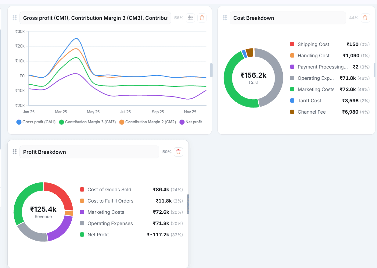
This dashboard breaks down profitability across every cost layer, from Revenue through to Net Profit, so you can see exactly where margin is lost rather than just what's left at the end.
From ₹125.4k in revenue, COGS accounts for the largest reduction at ₹86.4k, followed by marketing costs at ₹72.6k and operating expenses at ₹71.8k, resulting in a net loss of ₹117.2k. Each cost layer is visible as a separate segment, which means you can see whether the problem sits in product cost, ad spend, or operating expenses rather than treating net profit as a single unexplained outcome.
That distinction matters because the corrective action is different for each.
Example 3: Which marketing channels are delivering the best return on ad spend?
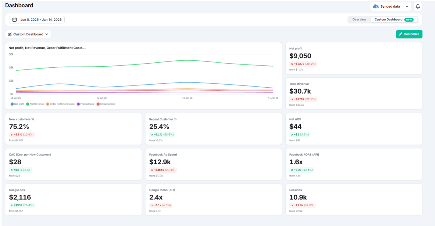
This dashboard compares Facebook and Google ad performance in one place to show which marketing channel is delivering the best return on ad spend. Here, Facebook became more efficient, with 27.4% lower spend and ROAS improving from 1.4x to 1.6x, while Google delivered slightly weaker returns despite a 20.4% increase in spend. Insights like these helps the merchant confidently decide where to allocate advertising budget and which campaigns need further optimization
These are three examples. Every business asks different questions, which is why the dashboard is configurable rather than fixed.
When Bloom's built-in metrics aren't enough, the Custom Metric Builder lets you go further.
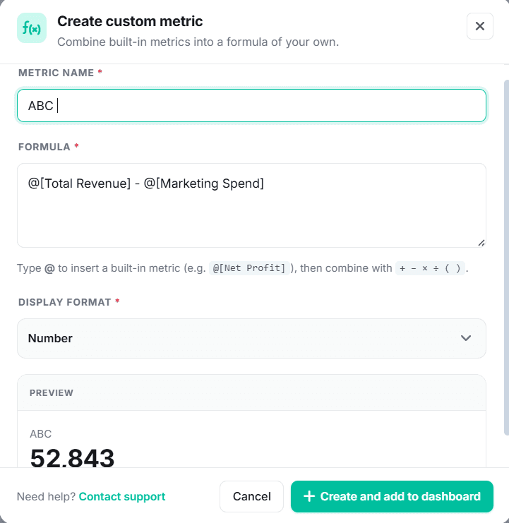
Combine existing metrics with custom formulas to create KPIs unique to your business. Bloom calculates the result automatically and adds it to your dashboard alongside standard analytics, so everything you need is in one place.
Conclusion
Dashboard customization isn't measured in the number of charts on screen. It's measured by whether the dashboard answers the questions you're actually making decisions from.
Shopify's native dashboard is a useful starting point. For a new store tracking revenue, orders, and sales trends, it does the job. As the business grows and the questions evolve toward profitability, marketing efficiency, product margin, and cost control, the native dashboard's constraint (you can only see what Shopify tracks) becomes a real limitation.
The merchants who get the most out of dashboard customization aren't the ones who've added the most cards. They're the ones who've replaced vanity metrics with decision metrics: not just revenue, but net profit. Not just ROAS, but break-even ROAS. Not just best-selling products, but most profitable products.
If your current dashboard can't tell you whether you're profitable, which products generate the most profit, or which marketing channels drive profitable growth, it may be time to move beyond Shopify's native dashboard.
Frequently Asked Questions
Can you customize the Shopify dashboard?
Yes. Shopify's Metrics Library lets you add, remove, rearrange, and resize metric cards on your overview dashboard. The limitation is that you can only display metrics Shopify already tracks. You cannot create custom formulas, add external cost data, or build metrics that don't exist in Shopify's native analytics.
What metrics are missing from Shopify's native dashboard?
Shopify's dashboard doesn't natively track true net profit, contribution margin tiers, break-even ROAS, blended customer acquisition cost, product-level profitability, or custom operational costs like product cost by date ranges or shipping cost by order attributes. These require either manual calculation or a third-party analytics tool.
What's the difference between changing your Shopify dashboard layout and changing the underlying data?
Changing the layout rearranges which metrics are visible and how they're displayed. Changing the underlying data means enriching Shopify's revenue figures with cost and profitability data which requires integrating product costs, fulfillment costs, ad spend, and operating expenses that Shopify doesn't track natively.
Do you need a BI tool to build a custom ecommerce dashboard?
Not necessarily. Business intelligence tools like Tableau or Looker Studio offer full customization but require significant build and maintenance effort. Ecommerce analytics platforms like Bloom connect directly to Shopify, combining store data with profit tracking, marketing attribution, and business costs without the need for a dedicated BI stack.
What is a custom metrics builder in a Shopify analytics tool?
A custom metrics builder lets you define your own KPIs using formulas that combine existing metrics. For example, you could create a profitability metric that incorporates specific cost inputs unique to your business, then display it on your dashboard alongside standard metrics. This lets you surface the numbers that reflect how your business actually measures performance.
Discover More